What is responsive web design? You design your website to look good with the wide screen desktop computers.
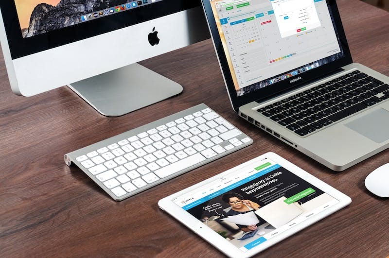
Your website must display well on mobile. Does that mean a separate mobile version of your website? How will your site look on the iPad, the new iPad mini or smartphone. You can create many versions of your website around each size of device. Then use a switcher script to display the proper version.
There is a better answer. The answer is a responsive website. This is one that responds to its environment and adapts to the size of the device you are using.
A website layout may be fixed in layout or it may reconfigure according to the device it is viewed on. Fixed, fluid, adaptive and responsive are the four terms used to describe how flexible a website is to the different screen sizes.
Fixed layout: The wrapper or container for the design is a fixed width and the design elements are not set to move or scale with a change in screen resolution.
Fluid Layout uses percentage for widths where components can stretch or contract with relative widths.
Adaptive Layout: A simple form of responsive design where it uses a series of fixed width designs. Uses media queries to present the correctly sized screen.
Responsive Web Design: Built on a fluid grid and uses media queries to control design as it is scaled up and down in the viewing environment.
With a responsive web design you don’t have a separate mobile website. Instead you have one website that responds, re-sizes and reconfigures itself according to the viewing screen. This is the future and the direction web design is headed.